Bond & Equity out, "Everything Else" in
Sector rotation written large
Visualizing the world’s assets
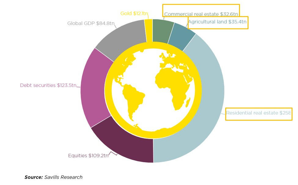
Some time ago, MacroAlf from the MacroCompass shared this graph below on his Twitter. I will use it as a base to explain something that seems to confuse a lot of investors.
In pink color are debt securities (essentially bonds, public and private) and purple color equities. For many investors, if people sell equities (like the recent market sell-off), they should either
keep money in cash (unlikely during raging inflation).
buy bonds.
But currently, both bonds and equities are getting hammered. So where did the money go?
Well, it’s simple, in the other TWO THIRDS of the graph, aka “Everything Else”
The parts finance people never talk about much.
I suspect we might see a multi-year trend of money flowing out of financial instruments (bonds and equities) toward the rest of the assets.
Money flowing toward (literal) concrete
One BIG money flow is into real estate. Are you wondering why real estate prices and rents keep going up, no matter what? Recession risks, rising rates, baby boomers selling, are still going strong.
That’s why.
When BlackRock pensions funds buy entire neighborhoods wholesale and retail investors look for “safety”, money flows out of financial instruments and into real, physical assets.
People who waited to buy a house are buying now before prices are permanently out of reach. In Estonia, I see land selling for more than it cost to buy the land + a house on it 5 years ago.
Rising mortgage costs might put a dent in this trend, but I am not sure prices will go down either.
Money flowing toward materials
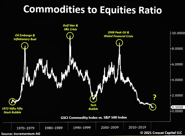
Another area with a long way to go is commodities. The stuff people actually need more than social media, online ads, and Netflix streaming.
Stuff like energy, to move around or not freeze in winter, food, and shelter. For example, the price of firewood in Estonia has doubled year to year and tripled over 6 years.
Source: Cresat Capital
You can count on exploding inflation on essential goods, recession fear, and war to make people re-focus quickly on the basics.
Commodities are not even on the graph at the beginning of this article. Not sure if they were not included, or just considered a part of global GDP.
With commodities, they are most of the time treated as unimportant. But when you feel you might run out, suddenly any price is better than nothing.
Since the start of the Ukraine war, just ask the EU about coal, gas, and oil, or the developing world about cooking oil and wheat.
Money flowing toward risk-free money
If equity feels risky, housing feels like a bubble, and bonds are getting slaughtered by rising rates, you might just want to sit it out. For the most risk-averse, no yield during a few years might feel okay. For sure, it’s better than rolling the dice on the “everything bubble”.
For this, there is the minuscule yellow section in the graph below.
Gold.
To which an even more minuscule slice would be silver. The previous metals segment could double or triple in size, and still be a minute portion of the world's assets. Not to be dismissed in a world paranoid from Covid, WWIII fears, food shortages, plus the economic apocalypse is apparently at the doorstep.
The argument that gold retained value for 5000 years has its charm frankly… That is why I own profitable gold miners like Regis Ressource and X64/1064 (former Medusa Mining) (follow the links for my reports on them).
Money flowing toward (vegetal) growth
I mentioned food and construction materials, which include wood, in the commodities part. Why not move money to what actually produces the stuff, which is fertile land. Farmland and woodland is the small section in deep blue above. Like gold, those could go up quite a bit, and not even drain much volume from the pink & purple color sections.
Food inflation is a nasty thing, that can trigger non-linear consequences. Like it’s already happening over the world:
https://edition.cnn.com/2022/05/10/asia/sri-lanka-protests-police-shoot-intl-hnk/index.html
https://www.al-monitor.com/originals/2022/05/nationwide-protests-iran-food-prices-increase
The list of food inflation riots is likely to keep going up. I expect to see soon on this list all the “-stan” countries, Egypt, Libanon, Syria, Turkey, Lybia, Morroco, Jordan, sub-Saharan Africa, Haiti, etc… I just hope it will not include India or other large countries.
I personally own my homestead and grow some food as a hobby and own stocks of CRESY for this reason.
Feel free to send me suggestions of your own ideas, especially publicly traded ones.
Money flowing toward non-western currencies & assets
If the Russian sanctions taught us something, it is that any financial assets are under someone's jurisdiction.
And that someone might just take it away.
Of its $600B reserves, Russia saw a half of it vaporize overnight. I know it is “frozen”. Like if Putin surrendered + ended up in a war crimes trial, maybe some of that money might make it back to mother Russia. I will not hold my breath waiting for it to happen.
Be assured that sovereign funds worldwide have taken notice. If you are the manager of the Saudi sovereign fund, do you still want to own dollar-denominated assets? Or will you discreetly look for an exit door?
For now, this change is hidden by the flow of money out of Euro/Yuan/Yen financial assets to US financial assets. So the USD is very strong.
But over time, we might discover that some of the money previously in the Western financial system is gone for good. These funds from Saudi, Qatari, Russian, and other “unpopular” countries will have sailed away for seemingly safer waters.
https://www.al-monitor.com/originals/2022/05/egypt-considers-issuing-bonds-chinas-yuan
Takeaway
Finance professionals can be very myopic and forget the rest of the world out of publicly traded bonds and equities. I expect the return of inflation to trigger a reality check on the assumption that financialization is a one-way street of permanent growth.
I will stay out of equities at the moment, short of specific sectors or companies (energy, farming, gold, commodities, discount seller, etc…).
Chinese tech is getting tempting but is not showing strong signs of having passed the bottom yet.
The dreadful performance and real yields of bonds make it a no-go zone.
Real estate, farmland, woodland, commodities, gold, and non-US denominated assets, all seems more attractive to me.
Honestly, I am thinking more and more about woodland as the next thing to add to my portfolio, as wood has intrinsic value for fuel and construction. And trees don’t consult interest rate forecasts to keep growing. I had looked into it a few years ago, and yearly yields were around 6-9% in my area. Not bad for a hyper-low volatility investment.
If you know any publicly traded option that manages their assets properly, please tell me, I struggle to find even just one land fund that does not waste tons of money on fees or unrelated investments like wood mills.


Great writing as usual Jonathan.
One of the highest quality wood producers I know of is UFPI.
Interesting piece. Forestry was something I had been half thinking about, last year an investment trust was launched which focuses on forestry mainly in the UK. Have not looked at it in any detail yet but will be interesting to see how it does over time. Website is here: https://fsfc.foresightgroup.eu/